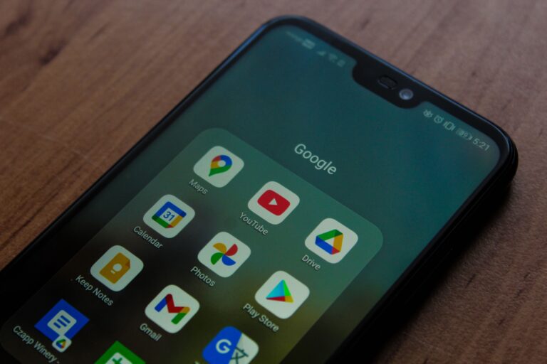

Today, people rely on their smartphones for almost everything—from searching for nearby businesses and shopping online to booking appointments and reading reviews. If your business website is not optimized for mobile devices, you are likely losing potential customers before they even learn about your products or services. A mobile-friendly website is no longer a luxury; it is a necessity for businesses that want to succeed in the digital world.
NetBitBliss understands that your website is often the first impression customers have of your business. That’s why creating responsive, fast-loading, and user-friendly websites is at the heart of every project we deliver.
A professionally designed mobile-friendly website helps businesses improve search engine rankings, engage visitors, and convert them into loyal customers.
What Is a Mobile-Friendly Website?
A mobile-friendly website automatically adjusts its layout, images, text, and navigation to fit different screen sizes, including smartphones and tablets. Instead of forcing users to zoom in or scroll sideways, responsive websites provide a seamless browsing experience regardless of the device being used.
Whether someone visits your website on an Android phone, an iPhone, a tablet, or a desktop computer, they should enjoy the same smooth experience.
Mobile Usage Continues to Grow
More than half of all internet traffic now comes from mobile devices. Consumers use their phones to search for restaurants, healthcare providers, educational institutions, local services, online stores, and professional businesses. They expect websites to load quickly and display correctly.
f your website is difficult to navigate on a smartphone, visitors will likely leave within seconds and choose a competitor whose website offers a better experience.
Google Prioritizes Mobile-Friendly Websites
Google uses mobile-first indexing, which means it primarily evaluates the mobile version of your website when determining search rankings.
If your website performs poorly on mobile devices, it can negatively affect your visibility in search results. A responsive website improves your chances of ranking higher for important keywords and attracting more organic traffic.
A mobile-friendly website also encourages visitors to stay longer, reducing bounce rates and sending positive signals to search engines.
Better User Experience Leads to More Customers
User experience plays a major role in converting website visitors into paying customers.
A mobile-friendly website offers:
- Easy navigation
- Readable text without zooming
- Fast loading pages
- Clickable buttons
- Simple contact forms
- Smooth checkout process
- Optimized images
When users enjoy browsing your website, they are more likely to contact your business, request a quote, or make a purchase.
Faster Websites Improve SEO
Website speed has become one of the most important ranking factors.
Mobile users expect pages to load within a few seconds. Slow-loading websites frustrate visitors and increase abandonment rates.
You can improve mobile performance by:
- Compressing images
- Using modern website technologies
- Minimizing unnecessary scripts
- Enabling browser caching
- Choosing reliable web hosting
- Optimizing CSS and JavaScript files
A faster website not only improves SEO but also creates a better customer experience.
Mobile-Friendly Websites Build Trust
Customers judge your business within seconds of visiting your website.
An outdated or poorly designed mobile website creates the impression that your business is unprofessional or unreliable. On the other hand, a clean, responsive website builds confidence and encourages visitors to engage with your brand.
Professional design, clear content, secure browsing and easy navigation all contribute to establishing trust with potential customers.
Increased Local Business Visibility
Many people search using phrases like:
- Website design company near me
- Best digital marketing agency
- SEO services near me
- Restaurants near me
- Plumber near me
Most of these searches happen on smartphones.
A mobile-friendly website combined with local SEO and an optimized Google Business Profile significantly improves your chances of appearing in local search results.
This is especially valuable for businesses serving customers within specific cities or regions.
Higher Conversion Rates
The ultimate goal of every business website is to generate enquiries, sales, or bookings.
Responsive websites improve conversions because users can:
- Call your business with one tap
- Fill out enquiry forms quickly
- Find products easily
- Read service information comfortably
- Complete purchases without frustration
Small improvements in mobile usability often lead to significant increases in enquiries and revenue.
Stay Ahead of Your Competitors
Many businesses still operate websites that are outdated or poorly optimized for mobile devices.
Investing in a modern responsive website gives your business a competitive advantage. Customers naturally prefer businesses that provide a smooth online experience.
A professionally developed website also demonstrates that your business is current, reliable, and committed to serving customers effectively.
Essential Features of a Mobile-Friendly Website
Every modern business website should include:
- Responsive design
- Fast page loading
- Secure HTTPS connection
- Mobile-friendly navigation
- Click-to-call buttons
- WhatsApp integration
- Optimized images
- SEO-friendly structure
- Easy contact forms
- Clear calls to action
- Accessible typography
- Consistent branding
These features improve both user experience and search engine performance.
Future Proof Your Business
Technology continues to evolve rapidly, and mobile usage is expected to grow even further in the coming years. Businesses that invest in responsive website design today are better prepared for future trends, search engine updates, and changing customer expectations.
A mobile-friendly website is not simply about keeping up with technology—it is about creating better experiences that encourage visitors to become long-term customers.
Conclusion
Your website should work as your most effective digital salesperson, available 24 hours a day, seven days a week. If it is difficult to use on a smartphone, you may be losing valuable opportunities every single day.
A mobile-friendly website improves search engine rankings, increases customer trust, enhances user experience, and generates more leads and sales. Investing in responsive web design is one of the smartest decisions any business can make in today’s competitive online marketplace.
At NetBitBliss, we specialize in creating responsive, SEO-friendly, and high-performing websites that help businesses grow online. Whether you need a brand-new website or want to upgrade your existing one, our team is ready to build a solution that delivers measurable results.